

A Respectful Response to “The Science Behind The Cholesterol Code”
John Slough argues our preprint has six "major problems." But how serious are the problems, and how consistently are his standards applied?

A recent video works through the KETO-CTA preprint we posted in January and lays out six “major problems,” building to the conclusion that the manuscript is “fatally flawed, statistically indefensible, and actively misleading.”
In this article:
We’ll discuss what a preprint is and why it matters
How AI has changed reviewing papers and how that applies here
We’ll evaluate the merits for each of the six items John outlines
We'll pull these together into a summary Risk Matrix
We’ll compare John’s standards against studies he’s reviewed more favorably, particularly the study he chose as a benchmark in his previous video on our research
I’ll give two respectful challenges
I will then give my final thoughts
Preprints are expected to have rough edges (and that’s part of the point)
Preprints are posted before formal peer review and should be understood as provisional. They may contain errors, omissions, incomplete reporting, or areas needing clarification.
Comparisons of preprints with their subsequently published versions suggest that reporting often improves and that additional data or analytical content may be added during revision, although most published preprints retain their central conclusions (Brierley et al., 2022). That does not make any individual error unimportant; it means only that identifying and correcting such issues is an expected part of the process.
By sharing work at an early stage, authors invite the broader scientific community to scrutinize findings, spot issues, and offer input that can strengthen the research long before it reaches journal reviewers. This is why I’m emphasizing the timeline for those unfamiliar with what preprints are.
Our research is controversial, but that’s all the more reason to maximize transparency for even the toughest of critics to weigh in — even before formal review. The catch is timing: if a critique arrives months after posting (in this case, John’s is arriving six months later), the manuscript is usually already in the formal peer review process — as ours is now — which is exactly when it’s appropriate to work the revisions through the journal rather than post a running series of public versions.
That said, I’m going to try and thread the needle of responding to what degree I can, but not disrupt the peer-review process we’re in now.
AI has changed everything, including how we review papers
Thanks to AI, we’re far better at spotting errors in papers than ever before.
Give a modern AI a published paper and some patience, and it will often flag mislabeled statistics, numbers that don’t match between text and tables, incorrect figure axes, and/or contradictory disclosures, often catching things human reviewers miss. Many of these minor issues were once quietly spotted by a few, but then ignored as harmless “easter eggs.” That assumption no longer holds—such problems are now detectable at scale on both new and old papers.
Errors are still errors, large or small. However, the amount of scrutiny applied determines what surfaces. Heavier checking on one paper than another can make the first look worse, not because it necessarily is, but because it was examined more closely — and this capability is multiplied dramatically with AI. But fair comparisons require the same level of scrutiny on both.
It’s worth noting research authors are interested in using AI, but there’s a reason many can’t simply hand the whole job to AI up front: institutions and journals set policies — still shifting month to month — on how much AI is permitted and for what, and much of this work involves sensitive patient data that understandably can’t be fed into these networks at all. So the tooling that catches these errors after the fact often isn’t the tooling an author was cleared to use while writing. (As an engineer, I have so much to say on how I feel about this — which I’ll be doing in my book.)
To be clear about my own use: I used these tools to pressure-test this response — and NATURE-CT — and checked every factual claim and quotation in this article against its source. That’s a separate exercise from the preprint’s original analysis.
John’s Six “Major Problems”
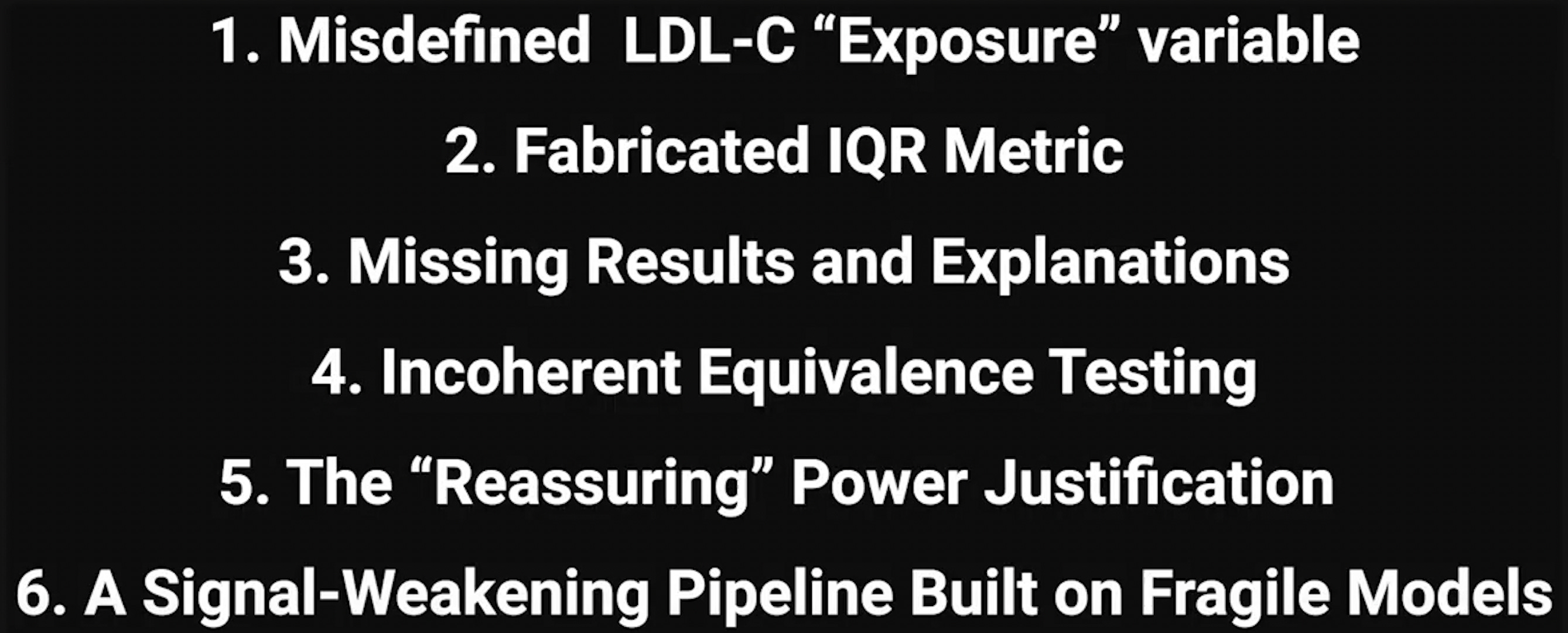
John outlines six items he considers “major problems.” I want to steel-man John’s positions as much as possible, including giving him credit where it is due.
However, I would likewise hope John would agree the standards he's calling out should apply consistently, particularly for studies he’s reviewed favorably. I’ll have more to say on that later.
How to size a problem
Okay, but before addressing the six issues John discusses, how can we quantify how “major” — or minor — a problem really is?
Let’s focus on one small example — one of John’s own from this video.
Early on, he makes a fair point: a number of participants in our study actually regressed; their plaque went down:
“Also, despite the problems, this study is interesting, and the dataset could be valuable, and we actually do see some participants with plaque regression. However, it’s only over 1 year, and we don’t know how this will play out long-term.”
John then animates a yellow band on our chart to highlight the regressors. This is the screenshot taken from his video:
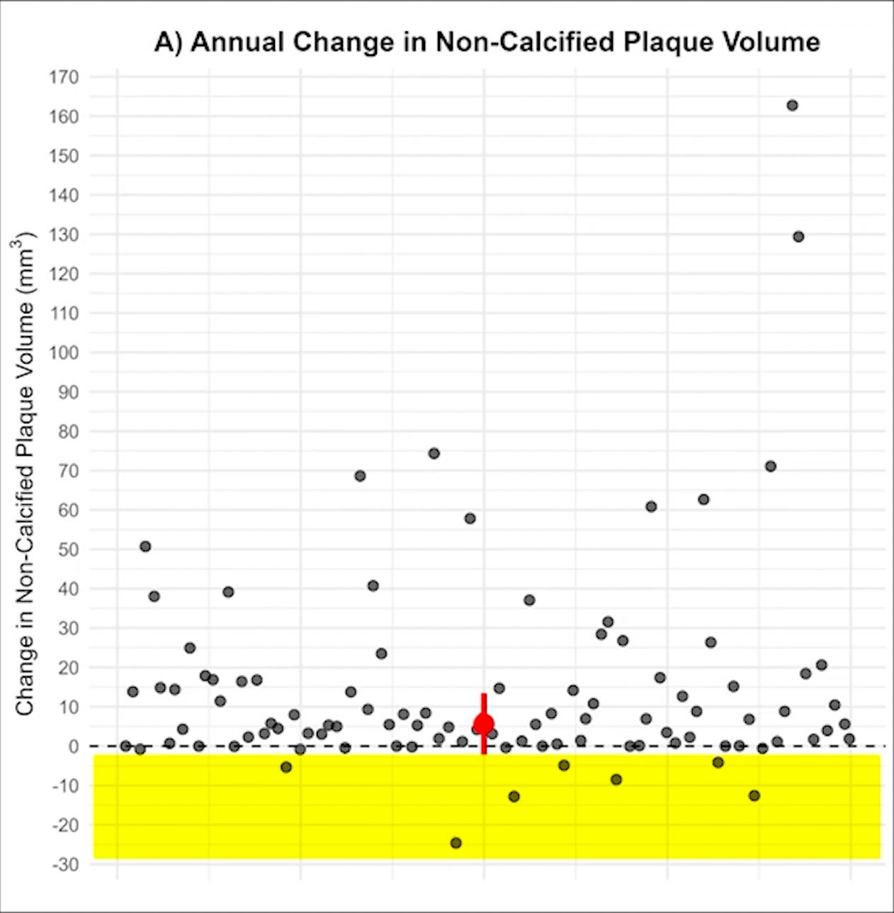
But the band is in the wrong place. Regression means a change below zero — below the dashed line. The top of his yellow band sits about two units lower, so it encloses 7 of the 15 people who regressed and leaves 8 out.
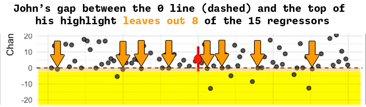
Is this a serious error? Is it worth making a big deal about? I don’t think so — and I would imagine most others would agree.
Stating “the band leaves out over half of the regressors in our study!” is technically accurate, but (1) almost no one watching would have come away with a different understanding because of it — his stated point was that some participants regressed, and some did; and (2) correcting the band leaves that statement where it was, since he says “some participants with plaque regression” rather than specify it was 15 (in the QAngio analysis).
These two considerations — probability of impact and severity of impact (and variations of them) — are often plotted as the axes of something known as a Risk Matrix. It’s a great way to size up how big or small a problem is.
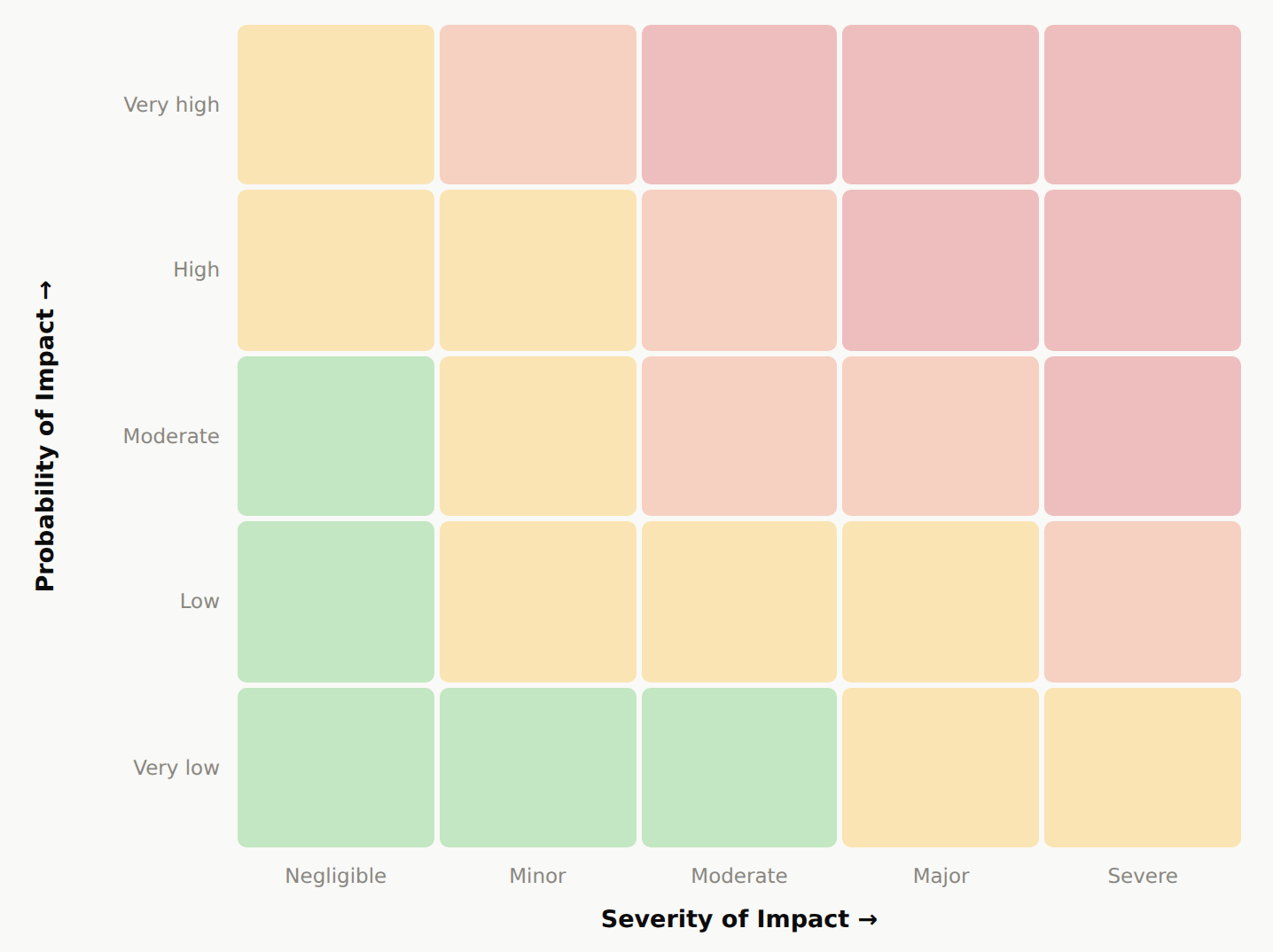
Probability of Impact is the chance the error actually changed what a reader came away with — not whether it’s visible, but whether it moved anyone’s understanding.
Severity of Impact is how much the finding itself shifts once the error is corrected.
An error sitting on page one can have a low probability of impact if no one is misled by it, and an error that misleads everyone who encounters it can still be minor if correcting it leaves the conclusion where it was.
Some simple examples at each extreme:
Low probability, low severity — a figure caption that misstates the follow-up interval while the title, abstract, and Methods all state it correctly, so almost no one is misled — and correcting it leaves every conclusion in the paper where it was.
Low probability, high severity — an error in a secondary analysis that few readers will ever reach, but which reverses that analysis’s direction once corrected.
High probability, low severity — a summary statistic misstated in the abstract, which nearly every reader absorbs and carries away wrong, while every conclusion drawn from it still stands once it’s corrected.
High probability, high severity — a headline finding built on a third-party analysis that doesn’t hold up: everyone who reads the paper relies on it, and correcting it overturns the paper’s main claim. (We’ll come back to this example.)
One note on how to read the first axis, Probability of Impact. What is key to keep in mind is: what would a reader have to believe for this error to change their conclusion, and does the paper lead them there? A reader raising it is real evidence — it sits where people look and registers when they get there. Silence proves less: it can mean nobody looked, or that nobody caught it, and those point opposite ways. So a low score has to rest on something structural that keeps the error from reaching the conclusion.
So to return to John’s misplaced yellow band: it’s a real error — but a small one. Its probability of impact is very low — a viewer who caught the band and a viewer who didn’t both come away with the same thing, which is that some participants regressed — and its severity is minor, since it has only a little weight-bearing on his statement as illustrated. So it would be placed on the bottom row, in the second square starting from the left — Probability of Impact: Very Low, Severity of Impact: Minor.
John’s Problem 1 — “Misdefined LDL-C ‘Exposure’ variable”
“A cumulative exposure should represent LDL-C over time, essentially area under the time curve… So calling follow-up LDL-C exposure makes it sound much more rigorous and more informative than it actually is.”
Per my note above, and not to take anything away from John catching it independently: this has already been raised in peer review several months ago. A reviewer flagged the same point — that baseline-plus-change shouldn’t be labeled as cumulative exposure — and on review, we agreed and had already addressed it in an initial revision.
Notably, we had already run models on each variant — baseline, follow-up, the change, and the two-visit average — all agreeing with each other.
I’d rate this item low on probability of impact, minor on severity.
Low on probability not because the label is buried — it appears throughout — but because nothing in the analysis depends on reading it as a lifetime measure. The posted formula reduces to follow-up LDL-C, so a reader who takes the name at face value and one who re-derives it land on the same number. Not on the same idea of what “exposure” means, though. John is right about that, and it’s why the label is already changing in revision.
Minor on severity because the variable we actually fitted doesn’t change, and because the absence of association with plaque holds across every variant we tested.
John’s Problem 2 — “Fabricated IQR Metric”
There are two separate claims here.
“They calculated the median plus or minus half of the IQR, which forces the interval to be symmetric around the median… making the middle 50% of the plaque progression look lower than it actually is.”
This first one is correct: the figure caption says the whiskers are the interquartile range, and they are actually the median plus or minus half the IQR. That is a labeling error in the preprint.
And he later states…
“This median plus or minus half of the IQR is not a standard metric. Nobody uses this metric. It does not exist. It is not taught anywhere… this metric has to be custom programmed.”
This second claim — that the quantity does not exist and is taught nowhere — is not correct.
The half-width he’s describing — half the IQR — is the semi-interquartile range, also called the quartile deviation: a standard, named statistic. (Centering it on the median to draw the whiskers isn’t the same as plotting Q1–Q3 — I’ll come to that — but the quantity itself is real and named.) This is a measure of spread defined in foundational statistics texts (Yule & Kendall, An Introduction to the Theory of Statistics; Spiegel & Stephens, Schaum's Outline of Statistics, §4.4).
Yule & Kendall, An Introduction to the Theory of Statistics — defines the semi‑interquartile range / quartile deviation as ½(Q₃−Q₁) (verified, pp. 147–148).
Spiegel & Stephens, Schaum’s Outline of Statistics, §4.4 — same definition, standard modern teaching reference (verified, 6th ed.).
There are also many modern online resources when simply searching “semi‑interquartile range / quartile deviation”. (Below is via Statistics How To)

Moreover, it’s worth noting that we are extraordinarily transparent with the data, with every point represented on the graph. In other words, the data itself already conveys the spread quite effectively — to the point where both kinds of whiskers are much less valuable, visually.
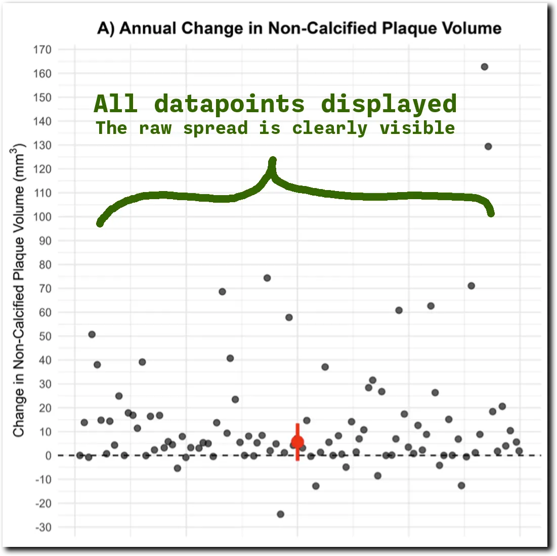
Now to the scoring. To be precise: the whisker half-width is the semi-interquartile range — a named statistic, so “it doesn’t exist” is wrong. What’s wrong is the label. Median ± SIQR isn’t the interquartile range, and on right-skewed data the two come apart: our lower whisker sits at about −2.2 while the 25th percentile is about +1.0. A reader who takes “IQR” at face value would put a quarter of the cohort below −2.2, and that isn’t where the data sit.
So there are two ways to square it, and only one of them is a correction. We can label the whisker what it actually is. Or we can plot Q1–Q3 instead — the more typical convention, and what we’re considering for the revision. The second isn’t repairing a bad statistic; it’s switching to a more expected one.
Either way the finding doesn’t move, because we plot every individual point — the real distribution is visible regardless of the whisker. A reader looking at that figure still sees the spread the data actually have, whether or not they read the whisker as an IQR. I’d rate it very low on probability of impact, negligible on severity.
John’s Problem 3 — “Missing Results and Explanations”
“They do not report the ApoB models anywhere...”
Correct. The ApoB model coefficients are not reported in the supplementary tables. ApoB is named in the conclusion, so that model belongs there, and we're adding it. This one is John’s catch, and credit to him for it.
This I consider the highest of the items John identifies on the risk matrix, with a moderate probability of impact and a minor severity. I rank its probability highest of the five because ApoB is named in the conclusion as a headline result, and a reader who goes to the supplementary tables looking for that model and doesn’t find it is left genuinely uncertain what it showed. That’s a real gap in what a reader can come away with, in a way the subtler labeling issues elsewhere are not.
But the severity stays minor because the problem is that the model wasn’t displayed, not that it was wrong or absent: the fix is to report the models fully — coefficients and confidence intervals, ApoB included — which we’re doing in revision; shown that way, that model tells the same story as the other lipid measures — no association with plaque change. The fix fills in a table — it completes what a reader can check, without moving the finding.
John’s Problem 4 — “Incoherent Equivalence Testing”
This is the most technical of the six, and I’m going to try to be careful and precise. That said, I’m ultimately deferring to our statistician on this one to expand on in a later piece (he’s currently unavailable due to prior commitments).
Let’s start with what John gets right. He raises two things here. The one I can settle now is the reporting inconsistency; the other — whether a single equivalence bound can carry across models whose slopes are in different units — is a real question, and it belongs in the statistician’s write-up rather than in a summary from me.
The supplemental analysis includes an equivalence test — a “two one-sided tests,” or TOST, procedure — and the way it specified its confidence setting in the Methods doesn’t follow the usual convention, and it doesn’t properly match the Discussion, which describes it as a 90% interval. That’s a real inconsistency, and we’ll be correcting this in the revision, with credit to John for catching it.
But here’s what matters for the finding: the equivalence test was never what the finding rests on. The manuscript introduces it with the words “to further support” the result — it’s a backstop, not the foundation. The result itself comes from ordinary linear regression, it holds across two independently-operated analysis platforms applied to the same scans, and it’s backed by Bayes factors of roughly ten to one in favor of no association. None of that depends on the equivalence test.
So the fair question underneath John’s point is: do the conclusions change with the correctly specified settings? At the package default (ci = 0.95, which yields a 90% equivalence interval, versus the 80% the preprint produced) — no, they don’t. Do they change with stricter settings (ci = 0.99 → 98%)? On the exposure variables the conclusion is actually about — ApoB exposure and total LDL-C exposure — the answer holds at both.
Ironically, there is one place the stricter setting changes a verdict. It isn’t on the exposure variables; it’s on a secondary model of the raw change in LDL-C, where the estimate is slightly negative — more LDL-C change tracking with marginally less plaque, not more. In the models and reruns described here, at no setting does a lipid measure turn into evidence associating higher lipids with more plaque.
In other words, the conclusions of the paper remain the same.
On the risk matrix, then: the correction is real, so it isn’t nothing — but the probability of impact is very low and the severity is minor. Very low probability because the finding never leaned on the equivalence test: a reader who took the TOST as written came away with the same conclusion as one reading it corrected. Minor severity because the fix leaves a supporting analysis supporting. Very low probability of impact, minor severity.
John’s Problem 5 — “The ‘Reassuring’ Power Justification”
“They use a post hoc or after the fact power calculation… A post hoc power calculation cannot turn we failed to detect an effect into there was no meaningful effect.”
It’s a narrow point, but one I’d like to grant — running a power calculation after the fact can’t convert “we didn’t detect an effect” into “there is no effect.” I think this is good feedback on the specific wording nuance.
But the null here doesn’t rest on power. It rests on two things the power calculation has nothing to do with: the point estimates for the lipid–plaque association sit near zero on both imaging platforms, and the Bayes factors run about ten to one in favor of the null over an effect. Under the specified prior, those Bayes factors favor the null by about ten to one — evidence for no association under that model, not proof that any effect is absent.
Or to state it a bit more plainly: remove the post-hoc power calculation entirely and the result is unchanged.
I’d rate this low on probability of impact and minor on severity — the power calculation is a supporting sentence, not a load-bearing one, so a reader who accepted it and a reader who struck it come away with the same finding, and taking it out changes the paper’s wording, not its finding.
John’s Problem 6 — “A Signal-Weakening Pipeline Built on Fragile Models”
“The models are crude, univariable simple linear regressions… they do not even adjust for basic confounders like age and sex.”
This one is different in kind from the other five. It isn’t a single finding I can check and correct — it’s thirteen separate statements about the study, stacked into one conclusion: that the design, the measurements, and the models each drain signal, and that what’s left is noise rather than a result.
The other twelve
Most of the thirteen name something factual. We did recruit through social media. There is no control group. The sample is a hundred people. The interval is one year. The plaque data are right-skewed. I dispute none of that.
But naming a feature of a study isn’t yet an argument about its result — for that, the feature has to be shown to push the association toward zero, and to push it hard enough to erase an effect of the size the prior literature predicts.
John claims the first — that these features drain signal. But he doesn't establish it, and doesn't reach the second.
Take the sample size. A cohort around our size over a year is ordinary for longitudinal imaging studies — a description, not a distinction. The question is whether it’s enough for the effect being looked for. The prior literature puts the LDL-C–plaque-change correlation between 0.4 and 0.6. The sample size itself was set in advance — 100 participants, assuming 15% dropout, against the plaque-change variability we expected. The figure people quote back at me, that ~80 participants would suffice for a correlation as low as 0.3, is labelled in the paper as not part of that original calculation, and I’d rather say so than let it read as prospective — it’s the same after-the-fact reasoning I just granted John under Problem 5. What it does establish is arithmetic, and arithmetic doesn’t care when it was run: at the effect size the prior literature predicts, a cohort this size isn’t underpowered. Being told the sample is “small” is not the same as being shown it was too small for the effect anyone claims is there.
Or take the recruitment. Social media recruitment produces an unusual sample, and ours is unusual — but it’s unusual in the exposure we selected on, not in the outcome we measured. Choosing participants by their lipid phenotype doesn’t, by itself, bend the direction of the relationship between lipids and plaque, though it does narrow the range we can observe it over. Choosing them by their plaque would.
The same gap shows up in the claim that our “LDL-C range is restricted to high and extremely high.” Our baseline LDL-C runs from 49 mg/dL to 591, with a standard deviation of 84.7 mg/dL — to date I haven’t found another longitudinal imaging study with a wider spread. And our Discussion already made the point that the observed values span a wide range. A distribution with a floor of 49 isn’t restricted to the “high” end.
The univariable modeling
The one item I do want to unpack — because it isn’t covered in the previous five, and because I think it has the most relevance of anything in the list — is the univariable modeling, and the absence of an age- and sex-adjusted analysis.
Reporting crude, univariable associations is a standard, accepted approach for a descriptive, hypothesis-generating analysis — not a causal test, and not a claim that lipids don’t matter. It’s also worth being precise about what an unadjusted model actually risks. It’s a strong reason to distrust a positive finding, because a confounder can manufacture an association that isn’t there.
This analysis reports an absence, and for a missing adjustment to have produced a false absence, a confounder would have to be actively hiding a real relationship — moving with LDL-C in one direction and with plaque in the other, hard enough to cancel it out. Age is the obvious candidate, and age tracks positively with plaque progression, so for age to be masking a lipid effect it would have to run negatively against LDL-C in this cohort. Nobody has proposed that.
And we don’t have to argue it, because we ran it. Adding age and sex, then baseline plaque, leaves the lipid coefficient non-significant (p ≈ 0.6–1.0). The crude and adjusted analyses agree: in this cohort, lipids didn’t track with plaque. Those numbers are going into the revision so nobody has to take my word for it.
That’s also why Problem 6 isn’t on the matrix. The grid scores errors, large or small — how likely one is to have changed what a reader came away with, and how much the finding moves once it’s corrected. A modeling choice you’d argue differently isn’t an error, and there’s no correction to plot — no revised number to set beside the original. I’ve kept it on the legend with the reason attached rather than quietly dropping it, because the note itself is worth taking.
I’m glad to take it to the team, as with the previous items. If we adopt it, it’ll be because we concluded it was an improvement on its own merits.
Putting the Risk Matrix Together
Here's where five of the six land, scored the same way — Problem 6 is the exception. (I’ve also included John’s own yellow-band error as the *, so the grid isn’t only scoring other people’s mistakes.)
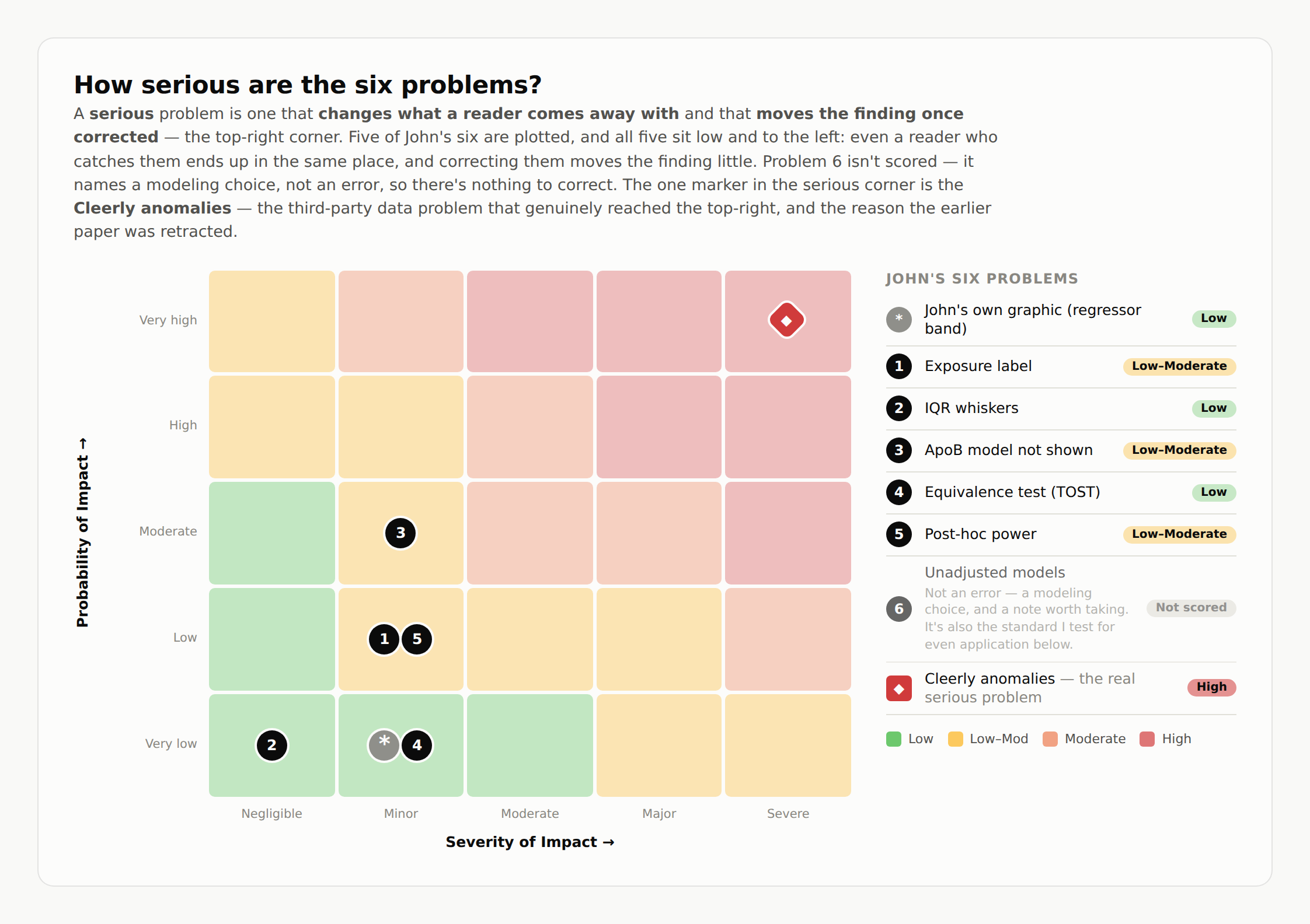
Five of the six sit low and to the left — little changed when corrected, and few readers would have come away with a different understanding on account of them (the ApoB-table gap is the one likeliest to have left a reader genuinely unsure). Problem 6, as noted, is a standard rather than a correction — and a standard is exactly the kind of claim you can check for even application, which is what the rest of this article does.
John cites the retraction, not the Cleerly anomalies behind it
The one marker in the serious corner — top-right — isn’t one of John’s six. It’s what our team concluded was a serious problem in the third-party Cleerly analysis behind our earlier paper — serious enough that we asked the journal to retract it.
Those anomalies aren’t part of the preprint, but they're relevant here because John revisits that retraction — which came at our own request, over the reliability of the third-party plaque analysis the paper was built on.
John gives the “what” — that it was retracted — without the “who” (we requested it) or the “why.” (In the earlier video he noted this somewhat; but here he just leaves it at “retracted.”) And without the why, most people reasonably assume a retraction happened to the authors rather than by them. Ours ran the other way — we asked for it — and here’s the why, from my announcement the day we made it (from the transcript, lightly normalized; emphasis mine):
…we’ve had multiple participants from the KETO-CTA study independently resubmit their heart scans to Cleerly. The results showed notable differences from the original Cleerly analysis. That said, these individual submissions were broadly consistent with the other independent analyses within our study. Moreover, after publication of the paper, we learned the data provided to Cleerly was not fully blinded. Despite our repeated requests, including offers to cover costs, Cleerly declined to perform a fully blinded reanalysis. It’s worth emphasizing, as with any other longitudinal study, it has always been the expectation of the research team that all analyses would be fully blinded. This isn’t just standard, it’s vital for the integrity of the study itself. Given we could no longer stand behind the Cleerly-specific portion of the April 7th paper, we formally asked JACC: Advances to withdraw this paper, citing this Cleerly dataset and [Cleerly's] refusal to perform any quality assurance to ensure its accuracy. On January 12, 2026, the journal confirmed a full retraction.
That’s a big part of the why, in our own words. I’ve said from the start I won’t read motives, and I’m not going to here. And in fairness, John does engage the retraction — the unblinding, and the cross-platform question — but to the best of my knowledge, he hasn’t commented directly on the participant-level resubmission anomalies shown below.
In the “It Got Worse” episode, John is candid about this: he states he isn’t adjudicating the dispute. Early on: “I just don’t want to get into the whole debate about that, because it’s not something that I have any knowledge about.” Near the end, after a long stretch on the unblinding question: “who knows what the hell is going on.” What I haven't seen him engage is the specific reliability evidence itself — whether Cleerly's numbers hold up when the same scans are re-submitted.
It’s possible John simply hasn’t seen the resubmission data — though it was part of our retraction announcement video (above), shown participant by participant. To remove any doubt, I’ll put it right here:
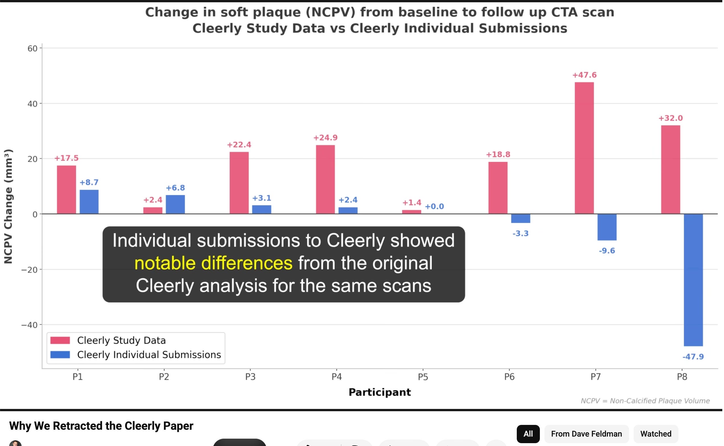
Each pair compares the original Cleerly study analysis (red) against the same participant’s re-submitted scan, re-analyzed by Cleerly (blue). For several people the numbers don’t just differ in size — they flip direction: P8 goes from +32.0 mm³ to −47.9; P7 from +47.6 to −9.6.
This is where I’ll be the most firm in this piece: the pattern above should interest every data scientist looking at this story — supporter or critic alike. The same scans, resubmitted to the same platform, materially different answers. That’s the reliability question at the center of the retraction, and it’s the one most in a data scientist’s lane.
A data-integrity problem in a third-party dataset isn’t vague to investigate — it has a specific toolkit in data science itself.
When a platform’s numbers are in question, the checks are reproducibility ones: does it agree with itself on a resubmission, and with independent platforms reading the same images? Our study is almost purpose-built for that test — three separate platforms quantified the same scans, and when participants resubmitted, the Cleerly numbers moved materially — and, in our own comparison, stayed broadly consistent with the other platforms’ existing analyses.
There is more in the original Cleerly dataset than I can cover here, and some of it can be reviewed directly from the open dataset linked below. That's a piece of its own.
(For reference to readers, our dataset for the previous paper has been available on Citizen Science Foundation (CSF) since May 2025 and can be downloaded here without restriction. Anyone can download and explore that visit-level imaging dataset themselves — typically with the help of AI. The re-submission summary is shown above; the full per-subject cross-platform tables behind our retraction account aren't public yet — but I’ll have more to share on that soon.)
Have John's Standards Been Consistent?
“I’m not anti-keto. I am anti bad statistical methods and bad statistical analyses.”
I’ll take him at his word on that, and I'm not going to speculate about anyone's motives — I'd ask the same in return. But notice what the phrase does.
“Bad statistics” isn’t a matter of taste, the way one might prefer one chart style to another — it’s a verdict, and John is asserting he can deliver it as a data scientist. He doesn’t call these “things I’d have done differently.” He calls them major problems, violations, a paper that is statistically indefensible.
That’s the posture of an expert who is enforcing standards. It comes with one obligation: a standard is only a standard if it gives the same answer regardless of whose work it lands on. So let’s check that — not against my standards, but against his, in the order he laid them out.
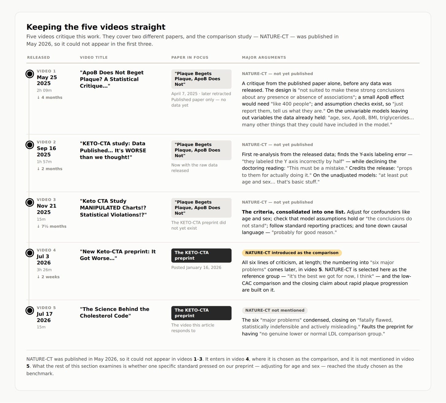
Is there consistency on criteria?
Last November, John released a video (See Video 3 in timeline, above) on our previous paper laying out the statistical criteria he argued it had to meet — adjust for confounders like age and sex, check that model assumptions hold, follow specific reporting practices, keep causal language in check. That's a distinct list, and it can be applied to any other study point by point, which is the fair test of whether these are standards or preferences.
However, in his very next video on our research, John selected a new study as a reference group to argue our study looks worse by comparison, and he chose one: NATURE-CT. John choosing this specific study matters. Whatever first put the comparison in the air, he’s the one who selected this study and vouched for it — “the best we got for now, I think.”
This is important because the paper documents almost none of these practices, and John raised almost none of them from the video before. It runs no regression models at all — it makes no covariate adjustment for age or sex, and the paper carries no data-availability statement and no code. To his credit, he does note some things that make the study less comparable — that it’s retrospective, that it’s “not a perfect comparison,” that he “wouldn’t take it as like a 1-to-1 perfect comparison” — and he even flags that the plaque-change table omits means. I want to be fair about that: he gave caveats.
Here’s the distinction, and I want to be precise about it: a purely descriptive paper doesn’t owe a regression model — so I’m not faulting NATURE-CT for not adjusting. But John doesn’t use it descriptively. He uses its numbers to conclude the keto group has a “much greater amount of people who have a rapid plaque progression” — a comparison. And the moment he makes that comparison, the very standard he made central against us — adjust for age and sex, or it’s “omitted variable bias” — applies to it. His cross-cohort comparison uses no multivariable adjustment beyond restricting on baseline CAC, across groups that differ in scan interval and referral. The standard John applies that governed our models doesn't govern the comparison he built from NATURE-CT's.
He was then asked about this directly in the comments under that video — “for fairness” — whether the NATURE-CT study had any statistical errors.
John’s reply:
“Generally the paper is just reporting the data with conventional summary statistics, without statistical modeling. I don’t see any major problems with it.”
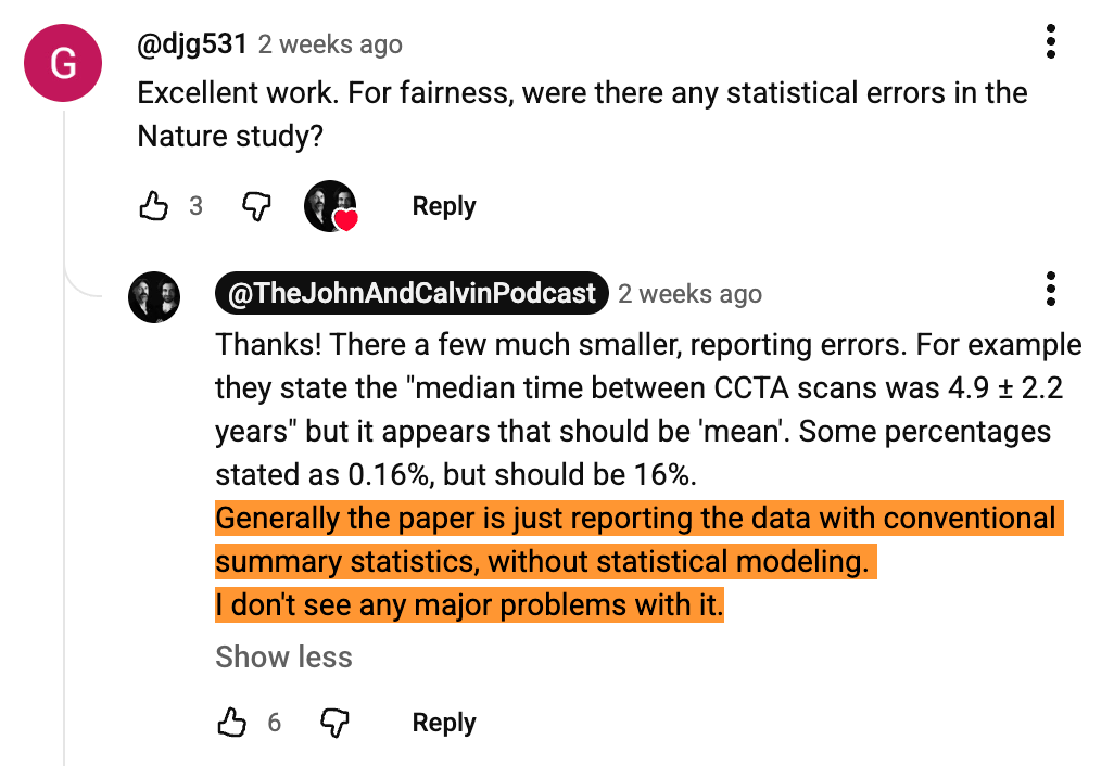
He pointed to a mislabeled “median” that should have read “mean,” and percentages “stated as 0.16%, but should be 16%” (a 100× difference) — filing both as “much smaller” reporting errors.
He filed those as “smaller.” But “no major problems” is a strong claim — so I did exactly what I described at the start: I ran NATURE-CT through the same kind of AI auditing, and verified the ones I cite here by hand against the paper. The two errors he named turned out not to be the only ones of their kind; a careful read surfaces more of the same class of reporting inconsistency than the one or two he characterized as trivial.
Importantly — I’m deliberately not cataloguing them exhaustively here as it’s simply more productive (and of course, better etiquette) to bring notice of these issues to the corresponding author directly and privately, particularly when our two studies are both, in part, in partnership with the same lab (the Lundquist Institute). I’ve sent the detailed observations directly to the paper’s corresponding author, Dr. Ronald P. Karlsberg, to help with any corrections they choose to make.
The only items I’ll need to be specific on with NATURE-CT will be covered in the checklist graphic below (“Do John’s standards travel?”) to allow specific and verifiable comparisons.
None of this makes NATURE-CT “a complete shambles” — that phrase was used on our preprint, and the issues are the ordinary, individually correctable kind. That’s exactly the point: they’re the same class of reporting slip John has cast as “smaller” on NATURE-CT and called “actively misleading” on ours. “No major problems with it” simply doesn’t survive the same lens he applied to our paper.
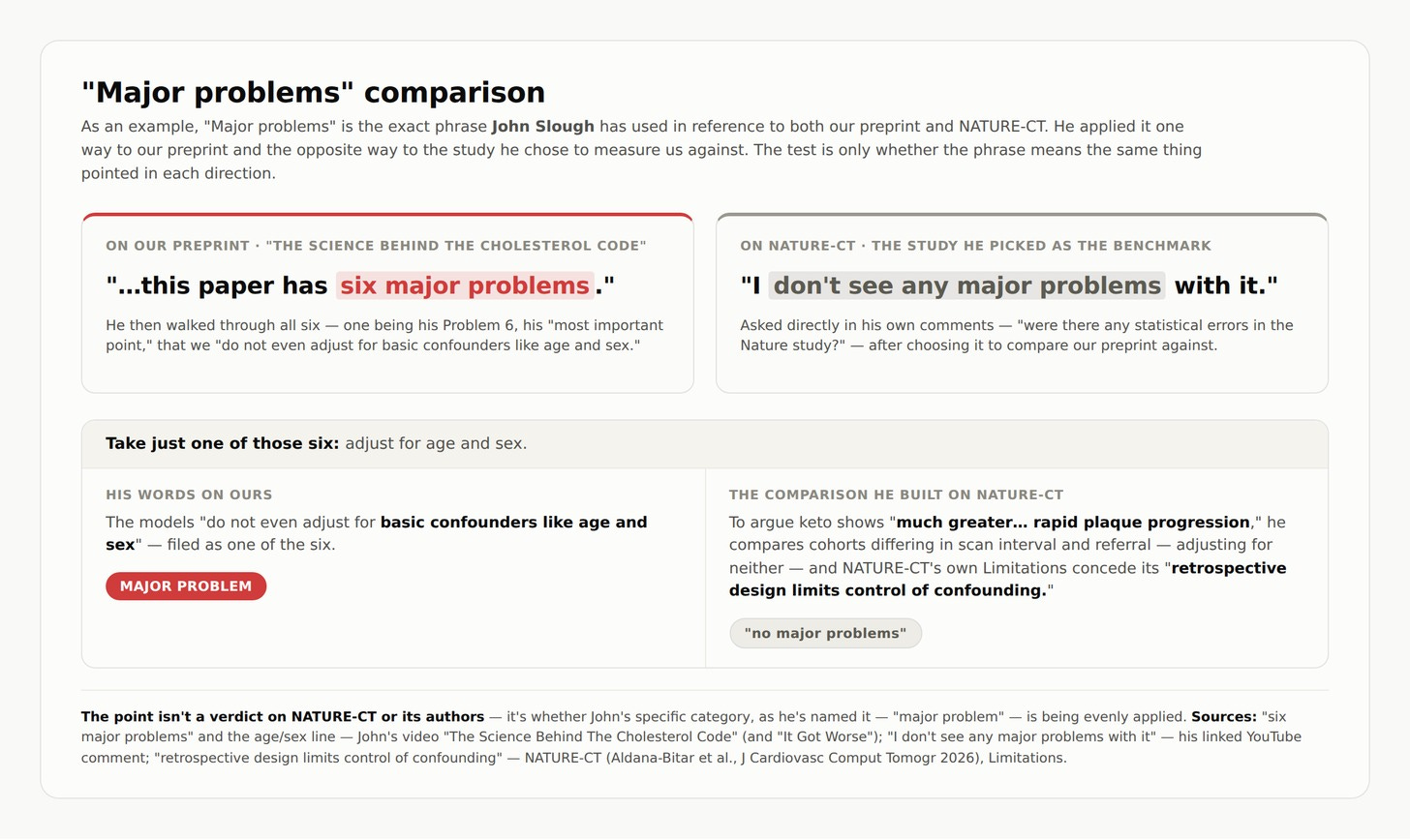
And “without statistical modeling” is offered here as entirely fine — “I don’t see any major problems with it” — even as the same modeling standard stays firmly on for our preprint. The point isn’t that NATURE-CT should have modeled; it’s that the standard is only being fired in one direction.
The same asymmetry runs through the other points he pressed hardest on. NATURE-CT’s paper carries no data-availability statement and no code — where he published his own reanalysis code specifically to contrast with us. It reports no confidence interval on its headline progression rate — a close cousin of the “serious reporting omission” he charged us with. And the model-assumption checks he ran on our data himself — the ones he called decisive, where “no statistician could look at that and say okay, there’s no problem with this model” — have no counterpart here: NATURE-CT’s methods prescribe paired t-tests for its continuous outcomes, yet the paper shows no paired-difference diagnostics and no normality check at all.
And the broader critique he leveled at our previous paper — stating conclusions without showing the analysis behind them, and running with no pre-specified plan — lands here too: NATURE-CT reports its progression findings as descriptive medians and IQRs with no p-values in Table 2 — even though its Methods state paired t-tests. It isn’t exempt as “just descriptive,” either — it runs its own paired t-tests and McNemar, so these reporting standards apply to it directly.
The checklist below shows where each of his own standards lands on it.
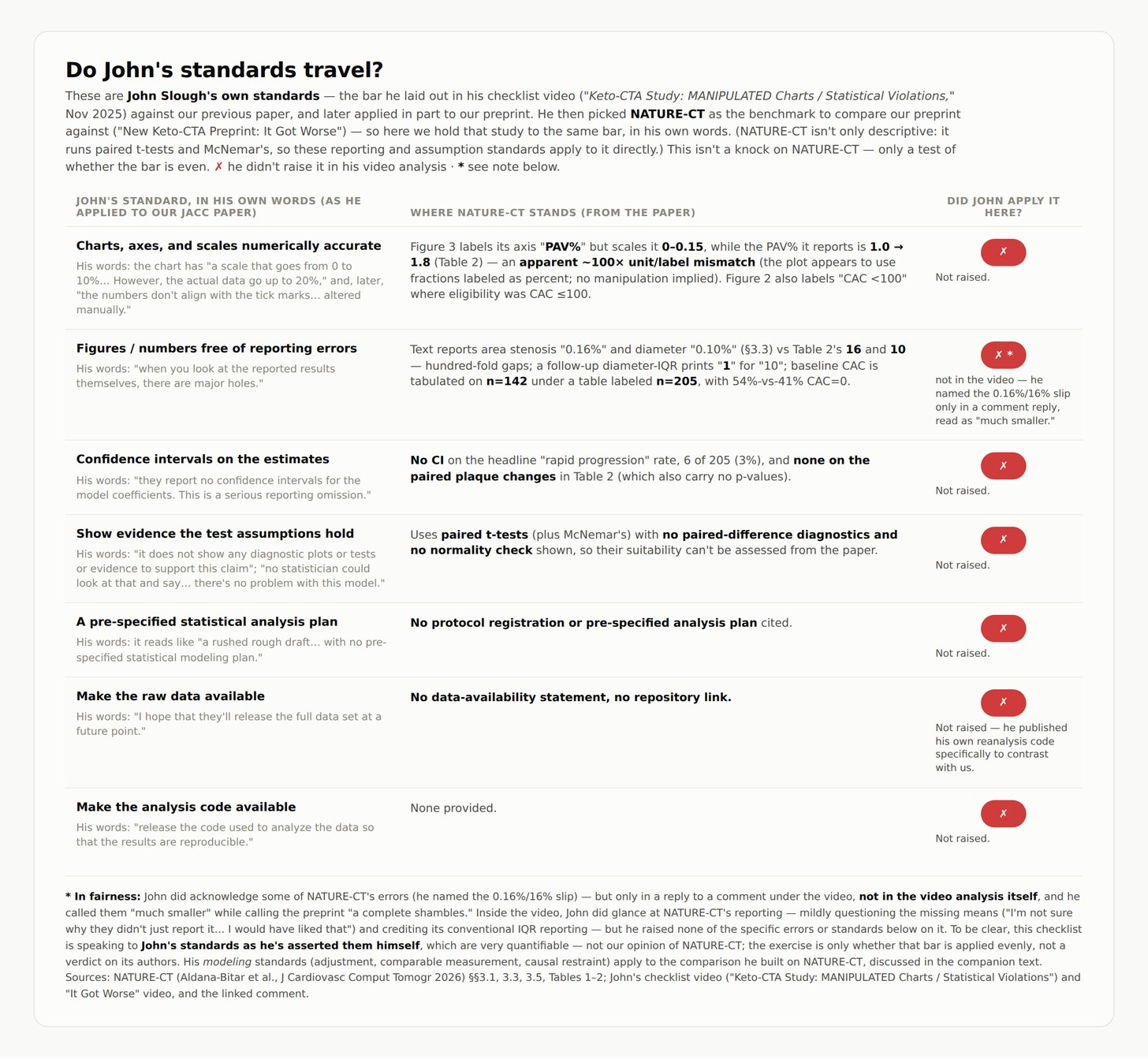
In short, the best way to evaluate John’s standards is to take his own checklist and see whether it lands evenly on the study he chose — here, NATURE-CT. The graphic above does exactly that, item by item, and the same checklist can be applied to other studies he’s reviewed in previous episodes.
And my larger point is that this kind of auditing is now something anyone can do with these rapidly advancing AI models — the whole reason I flagged it at the start. I ran it on our own preprint too, not only on NATURE-CT, and it flags things in our paper as readily as in anyone's. That's precisely the point: this is the new normal for every quantitative paper, ours included, and the fair response is to hold them all to it evenly rather than one of them selectively.
Is there consistency on the evidence bar?
The sharpest version of this isn’t what he asked of our models — it’s what he asked of his own.
He pressed age/sex adjustment on our work and kept pressing it, including in the same episode where he built his NATURE-CT comparison. The standard didn’t switch off; it just never pointed at the benchmark he chose.
His own low-CAC comparison is the clearest case. He spotted the confounder himself — “plaque predicts plaque,” so a group starting with less plaque may progress less, which makes it “not exactly a fair comparison for keto” — and he named the fix: restrict the keto group to those with CAC under 100. He didn’t have our follow-up plaque data, so he estimated what that subgroup would show. From that estimate he concluded it had “dramatically more rapid plaque progression than the nature study in all 3 methods.”
There’s the asymmetry in a sentence: what our models weren’t allowed to conclude from data we measured, his estimate was allowed to conclude from data he didn’t have. That’s the inconsistency, and it’s what the word “standard” is supposed to rule out — a standard gives the same answer, whichever paper it’s pointed at.
Is there consistency on causal language?
There’s a second thread worth pulling here, on causal language specifically — because it’s a standard John has been especially firm about. Throughout, he’s held that our data can’t support causal or comparative claims: the study is descriptive, underpowered, a single year long.
I partially agree, and we say much the same in our own Limitations. But watch what happens over the course of the “It got worse…” video. Early on, discussing the keto plaque metrics, he says they should be read as “just descriptive of this group” and — his words — “not generalizable or causal or predictive.”
Then, roughly forty minutes later, he builds his closing comparison on them anyway. His words: “You see 2 groups that are relatively comparable in baseline metrics and even, you know, the keto group other than the LDL-C is generally healthier. But then you see much greater amount of people who have a rapid plaque progression in the keto group.” Set the tone aside and look only at the structure of that argument — two groups he calls relatively comparable, one difference he foregrounds, therefore a conclusion about progression. That is the causal-flavored, matched-comparison form of reasoning he had just said these metrics could not carry, and the same kind of language he insists our paper isn’t entitled to.
To his credit, he qualified the comparison repeatedly — “not a perfect comparison,” “I wouldn’t take it as like a 1-to-1 perfect comparison,” “not exactly a fair comparison for keto,” and that the differences “could cut both ways.” I want that on the record. My concern isn’t that he skipped the caveats — it’s that the strength of the closing claim outruns them: the qualifications describe a comparison you can’t lean on, and the finale leans on it anyway.
So I’ll close this the way I’ve tried to hold the whole piece — with a question rather than a verdict. If you’d known that the standard used to condemn our paper — adjust for basic confounders like age and sex, which he has pressed steadily from his first video on our work through his most recent — is one he didn't apply when he built his comparison on the study he chose to measure us against, would it change how you weigh that conclusion? The ask is simple and fair — hold his conclusions to the same test he holds ours to: check it, and see whether it’s applied evenly.
Two respectful challenges
I’ll end with two asks — of John, and of anyone doing this kind of work, myself included.
The first is about consistency. AI has made finding flaws cheap. Point a capable model at any quantitative paper and it will surface something — I’ve used it here, on our own preprint as much as on NATURE-CT. But that shifts where the judgment sits. When the finding is easy, the weight falls on a different decision: which papers you point it at, and how hard you press once you’re there. A bar applied at full strength to one paper and half strength to the next isn’t a standard; it’s a preference wearing a standard’s vocabulary. I’m not asking for a gentler bar. I’m asking that whatever bar is set for our work be the one carried to the next study, whatever it finds.
The second is about proportion. Errors aren’t all the same size. Some move a paper’s conclusion and some don’t, and that difference matters more than the count of them. It’s why five of the six went on a matrix instead of being simply conceded or disputed one by one: a mislabeled whisker and a headline finding built on a third-party analysis that doesn’t hold up are not the same kind of problem, and treating them as interchangeable tells a reader nothing about which one to care about. So the second ask is that the sizing travel too. If a class of error is fatal in one paper, it’s fatal in the next paper that has it — and if it’s minor there, it was minor here.
Final thoughts…
I want to close on a positive note.
Yes, I’ve had a lot to call out with regard to what John's analysis has chosen to focus on, not focus on, and the consistency of how these criticisms are applied.
That said, I truly value the added time and care behind the critique. And I’ll again emphasize John has spotted items worth addressing in the present manuscript, even if they are low on probability and severity of impact — they are still worth consideration and correction, and I’m very thankful for the feedback.
This is an adult response. This is how methodological critique should be answered. Feldman acknowledged the legitimate reporting and labeling problems, quantified their practical impact, showed that the core result survives the corrections he is making, and then tested the critic’s standards for even application. Spot on.
So after all this, the primary conclusions still hold up?
Sounds like it's not fatally flawed at all. You are being nice, because it sounds an awful lot like hyperbole from John and is hard to take serious - which is a shame as he has some decent and helpful feedback obviously.
But of course, those parading around John's video are all entirely repeating the "fatally flawed" nonsense.